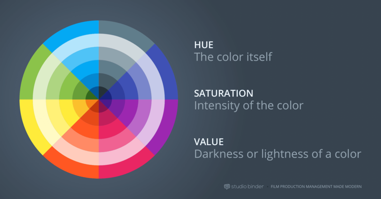
Color theory, particularly in cinema, is a conversation we could spend years discussing and debating. However, for our purposes (and the sake of your sanity) we’ll limit it to three different ways you can use color to tell and/or enhance your story. Let’s start with the basics- there are three main components of a color: hue, saturation and value. These three components, paired with the wide spectrum of colors, allow for limitless possibilities. Color is such a significant element as it translates to the viewer subtle, unspoken cues regarding the emotion of a scene, or the motivation of a character. Whether you’re looking to let color tell a significant portion of your story, or merely dip your toe into the possibilities, we have a "hue" suggestions…
Photo courtesy of: Studio Binder
#1: Use a singular color to convey or evoke certain emotions.
Singling out a particular color not only emphasizes it from the surrounding objects, but many colors bring with them a list of associated emotions. You can look at a list of colors and some of their associated meanings here, via the Psychology of Color in Film. Sin City (2005) uses a technique known as color discordance, which is “any deviation from the film’s color scheme” to immediately capture the audience’s attention (Studio Binder). This technique can be seen as a single, vibrant color against a typically monochromatic color palette. Oftentimes, the selected color reoccurs throughout the piece as it serves as a reminder of the emotion it symbolizes.
For example, in the Hessler music video “Stuck On You”, the color red was singled out because “the color [red] represents passion, fiery passion and the theme of this video has to do with obsessive attachment,” explained the video’s creator Craig Bass. Not only does the color tie the narrative together, as it weaves a similar undertone throughout the scenes, but it also adds a level of visual continuity.
You can watch the full video here.
#2: Consider using black and white to set the tone, shift or transition the mood.
Before color became an industry staple, there was standard black and white film, which could be tinted or hand colored. Referencing the article “How Color Changed the Movies,” it wasn’t until 1910, that “the Kinemacolor company perfected a way to synchronize a camera to take red and green alternating frames,” becoming “the first system to record any form of actual color in motion pictures.” Before color was customary in films, the choices surrounding it had to be more intentional: there was no Ctrl+Z to help you if you botched a scene. However, as the use of color in film became more accessible, it transitioned from a luxury to a stylistic choice.
Black and white can signify a memory or something passed, or it can signify something is lacking for our characters. Take Dorothy in the Wizard of Oz (1939), color can change and transition along with your characters to reinforce their own personal growth. As Dorothy leaves Kansas for Oz, she is transported from a dull, colorless world into a vibrant world filled with saturated colors.
A similar approach can be seen in the UCAN sample, a non-profit video that Motion Source produced in 2014. The video begins in a very desaturated world to represent the hardships that these subjects face. It then transitions to a dynamic, full-color world, promising hope and excitement.
UCAN watch the full video here.
#3: Use a color palette.
This is my personal favorite, as I find it equally exciting and challenging! Not only are coordinated color palettes aesthetically pleasing, but it also pushes you to think outside of the box for ways to incorporate the designated colors in relevant and attractive ways. Directors such as Wes Anderson or Tim Burton are great resources for designated color palettes, not to mention a fun source of inspiration; your color palettes can be anything from monochromatic to complementary. By incorporating a color palette throughout your piece, you are fully immersing your audience into your world.
A great way to incorporate a color palette is to use your company colors to create a theme within a brand video, or even an explainer video, to keep topics tied together. You’ll notice how our Addison Group brand video incorporates the company’s colors and logo to show and tell the viewer about the company. This technique allowed our visuals to remain congruent via a central visual theme.


You can view the full video here.
Whether we know it or not, color theory permeates so many of our daily decisions, from what to wear to what attracts and retains our attention. Using color intentionally allows us to express ourselves even more thoroughly to our audience. Color can help signify your character’s mood, it can reveal subtle hints to the audience, or it can be used to grab and hold your viewer’s attention. So, whether you’re posting a new Instagram photo, or working on rebranding your company, keep in mind that an intentional approach to color can enhance your message.


